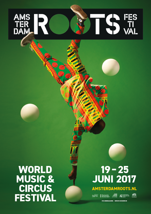
Visual identity for the most colorful music and circus festival of Amsterdam
Amsterdam Roots Festival is an open-air music festival that has been around for more than thirty years. Roots is all about world music and talent.
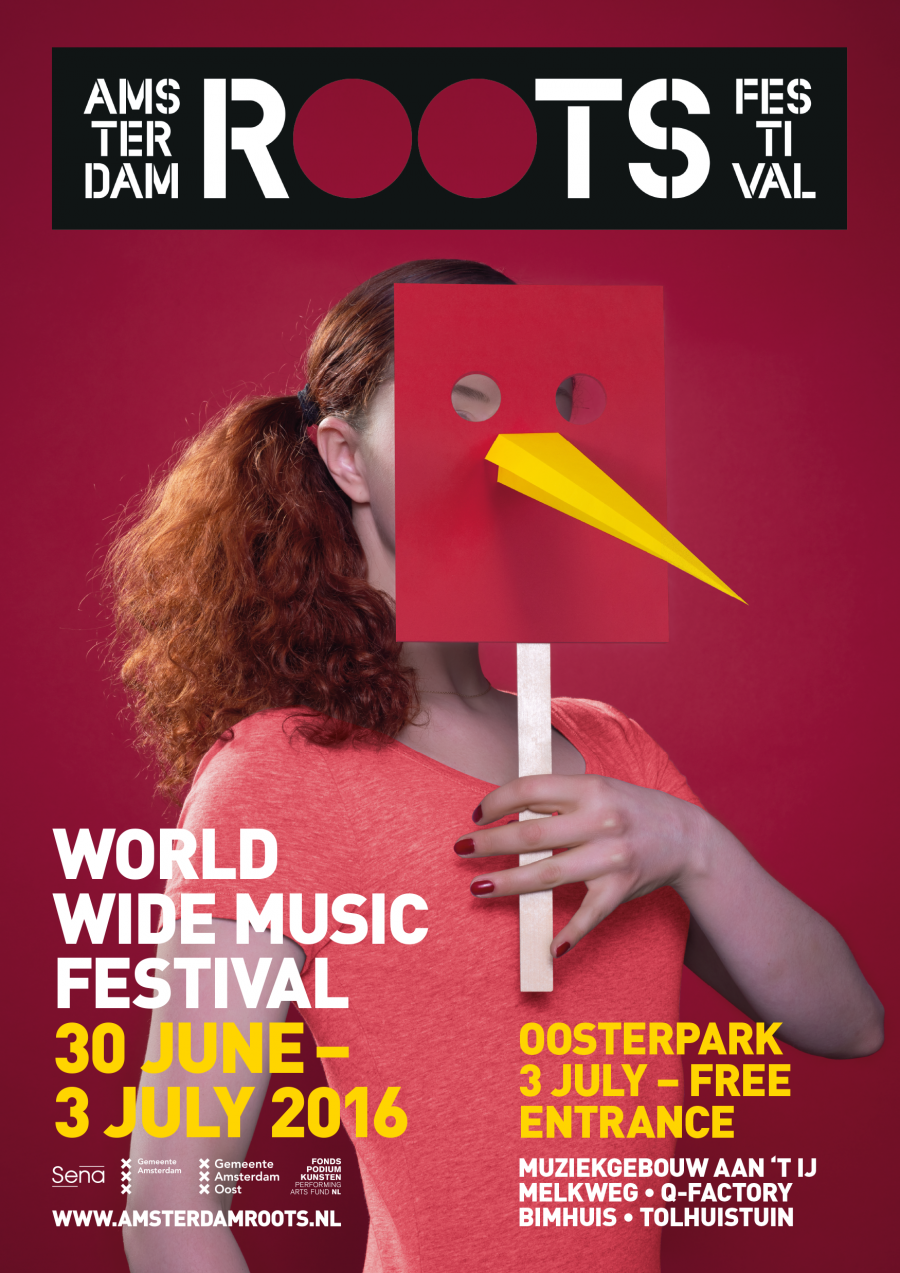
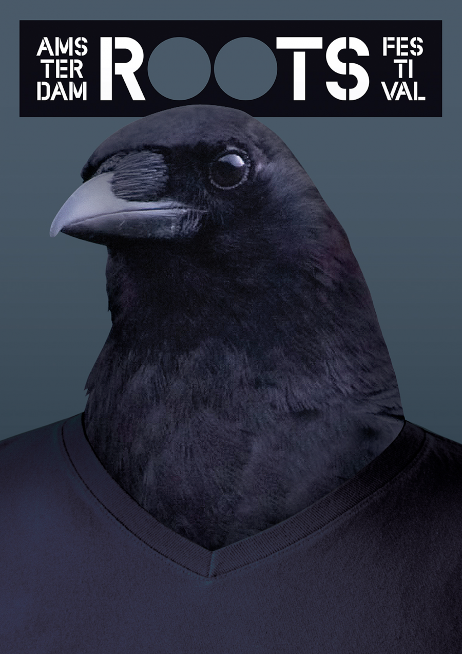
In 2014, De Designpolitie restyled the identity, website and campaign materials, keeping the most iconic features of the festival’s visual communication – a stencil font and a bird-mascot – and gave it a whole new meaning and system.
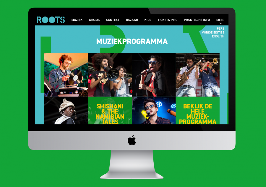
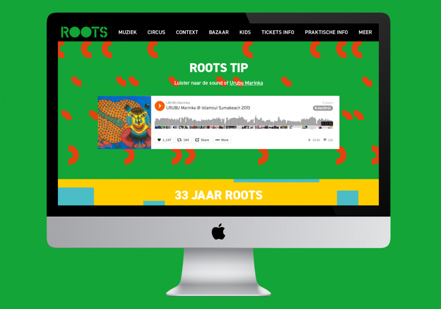
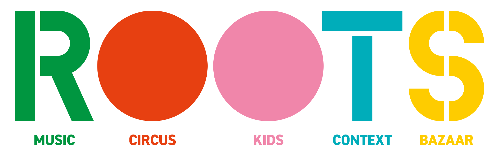
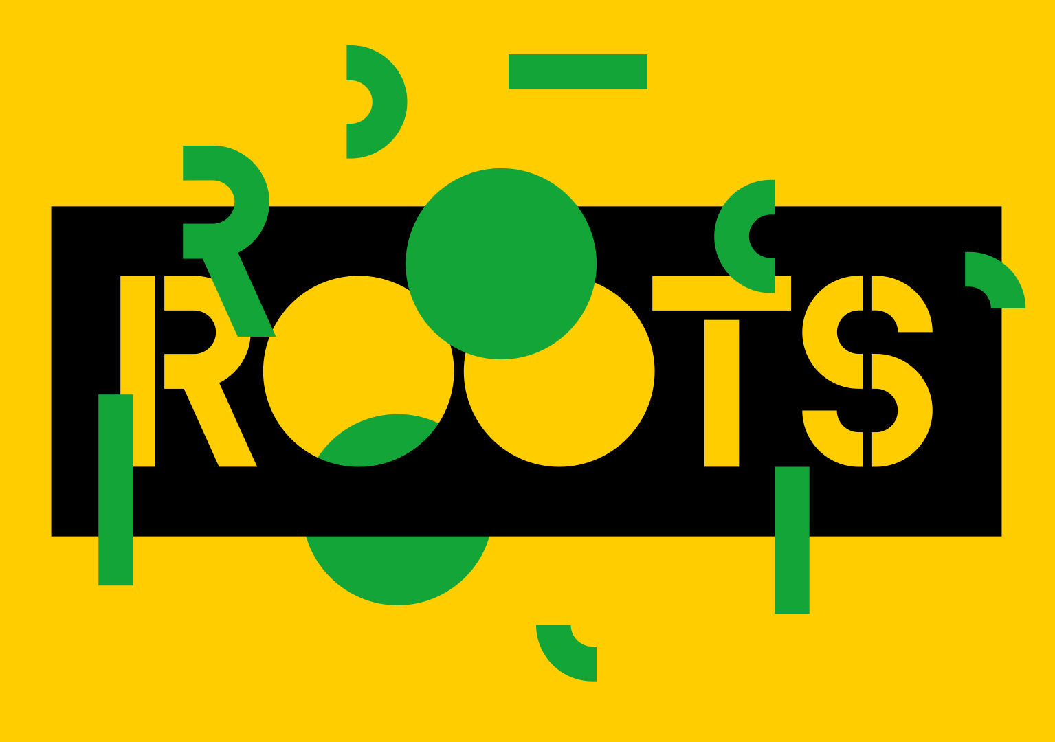
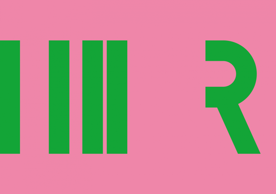
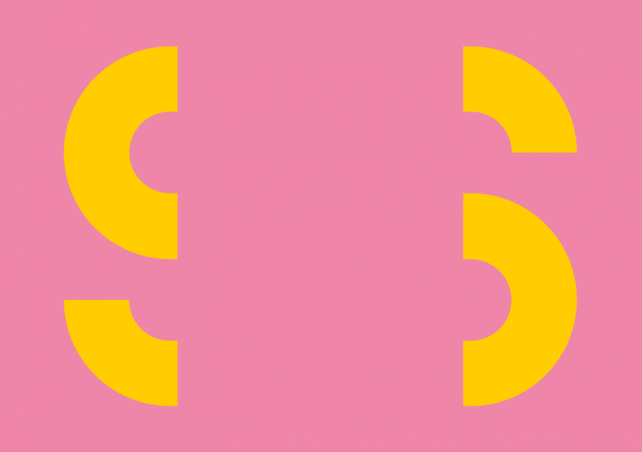
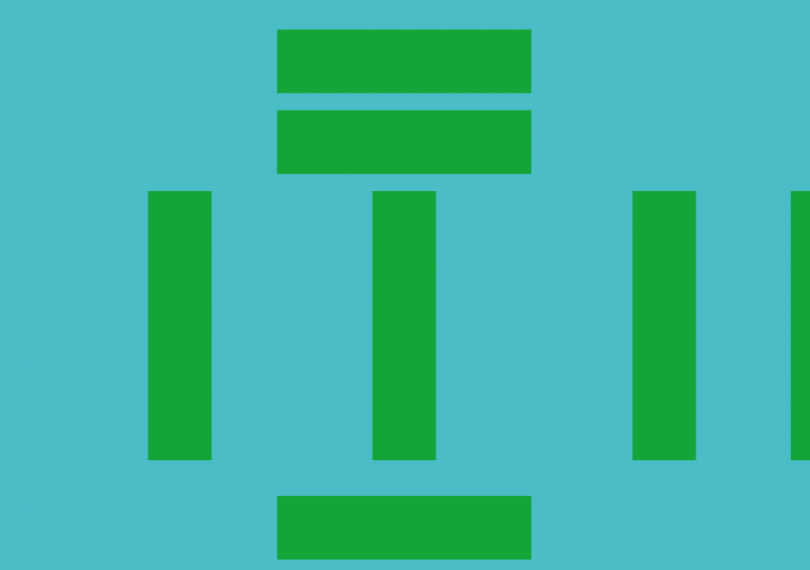
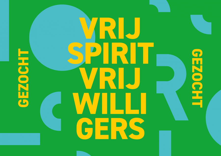
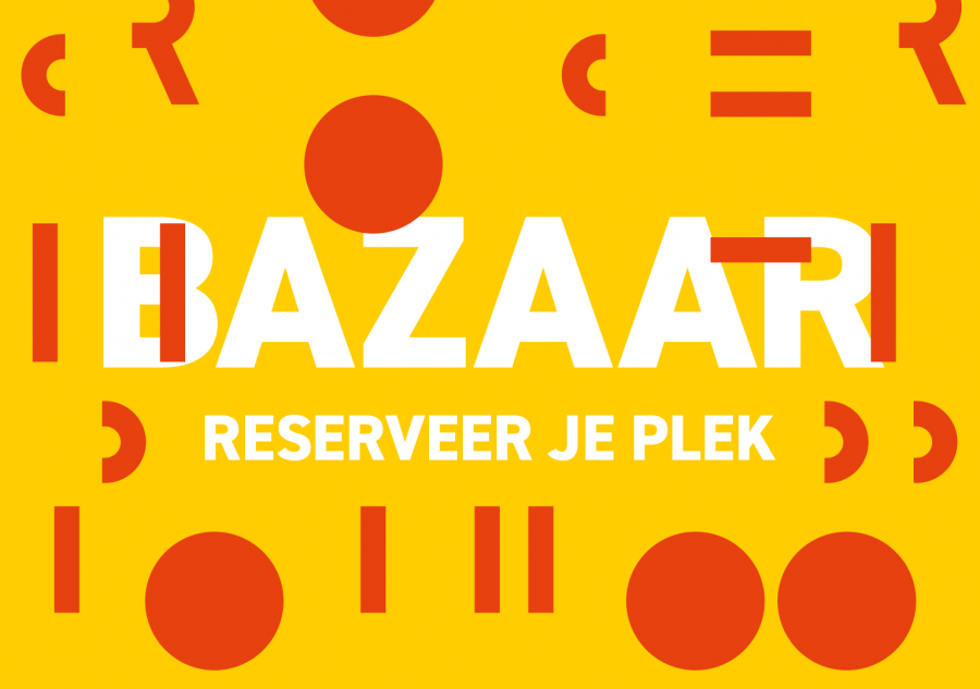
First, we created a complete stencil font, in which the characters can be separated in pieces, becoming abstract graphics that can be used to create patterns, frame information or “brand” photographs.
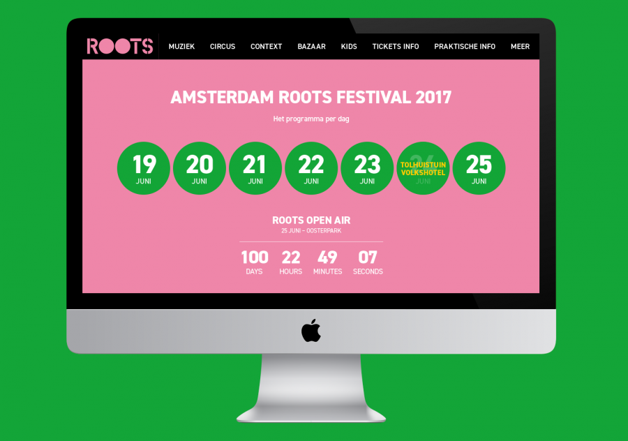
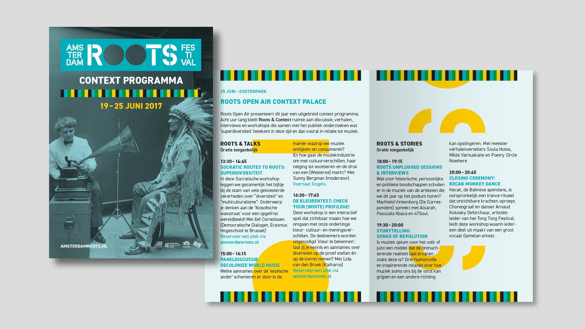
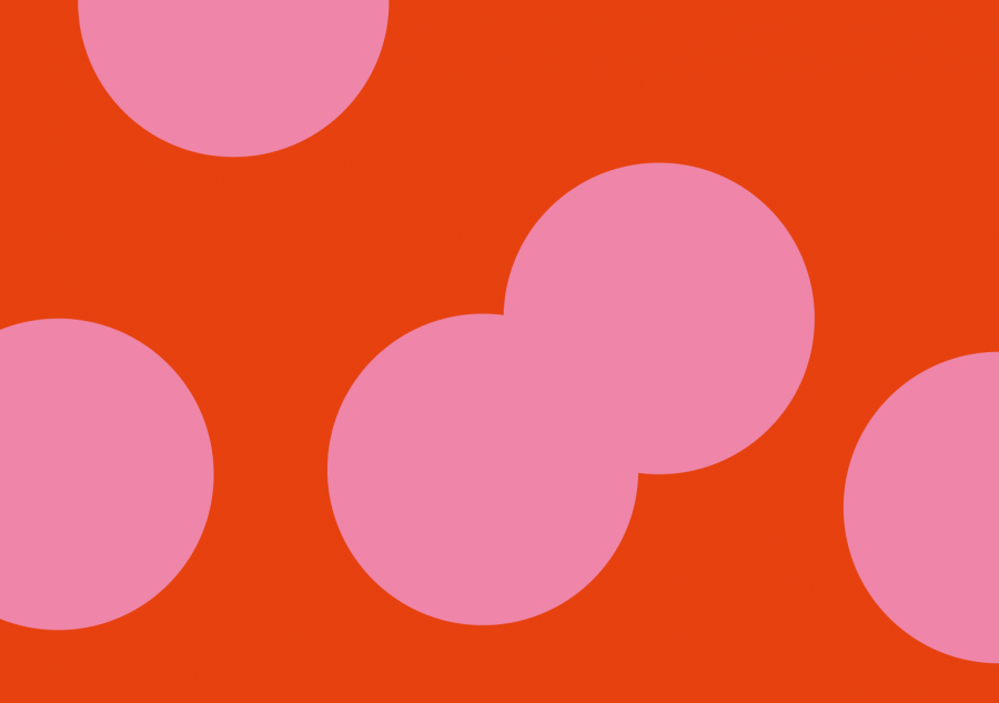
Next to that, we added a color scheme to better organise the five disciplines covered in the festival’s programme: music, circus, bazaar, kids programme and documentaries programme.
All together it makes a very recognisable and flexible visual identity system.
The annual campaigns
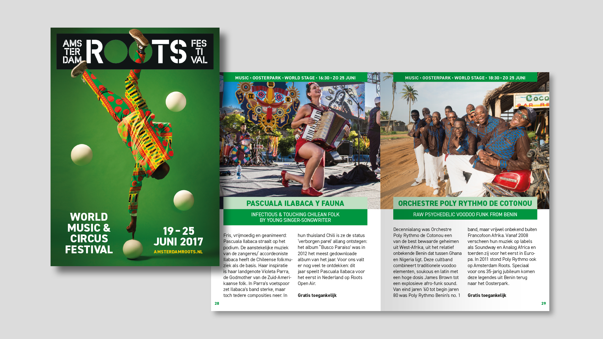
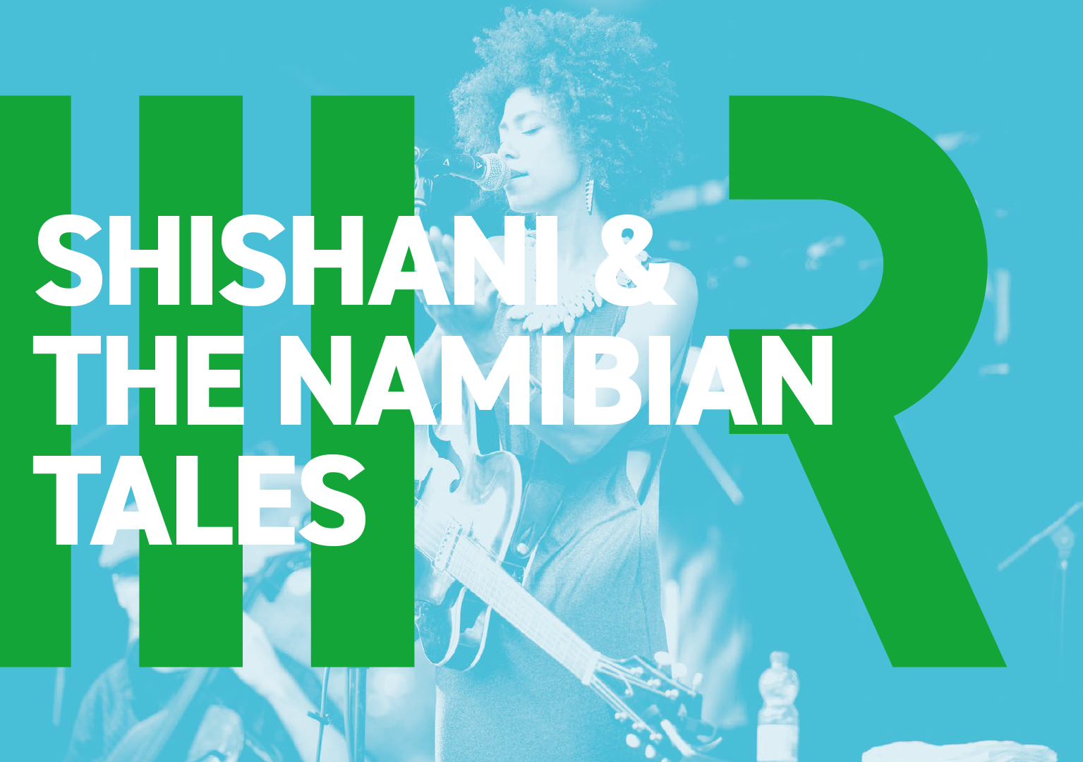
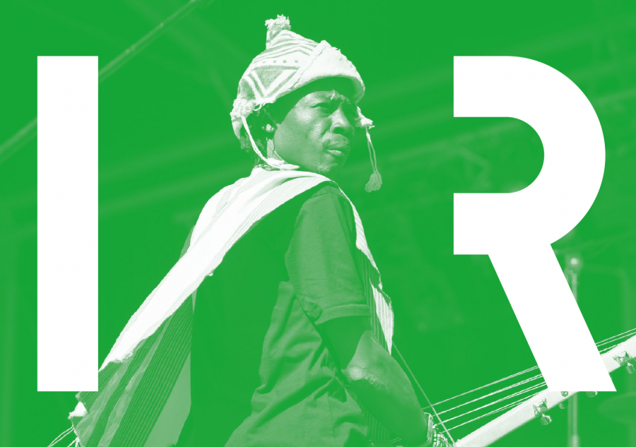
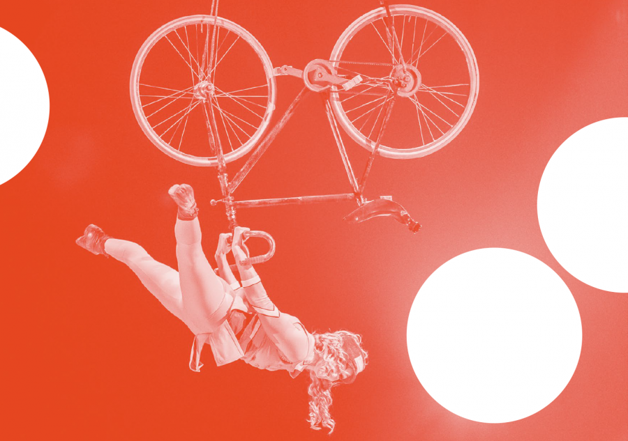
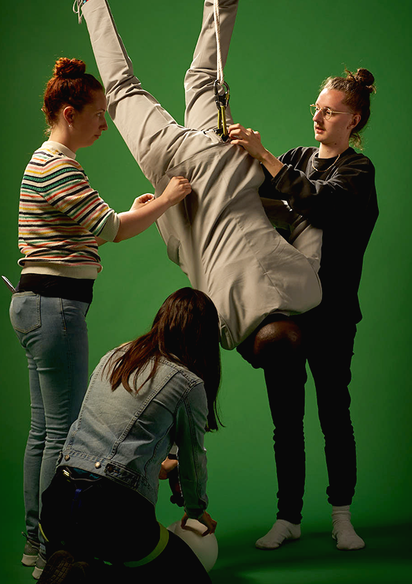
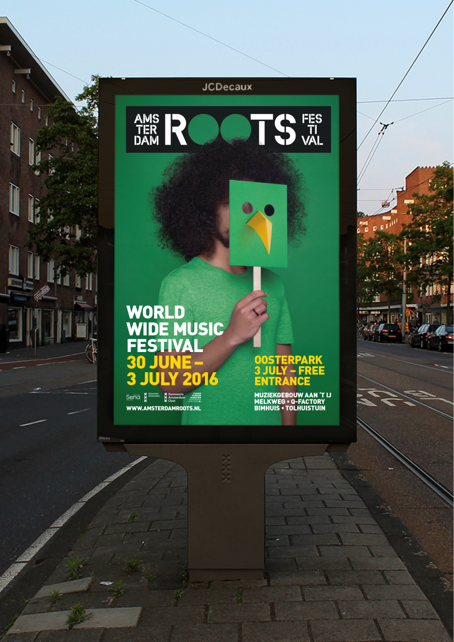
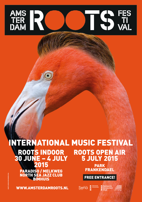
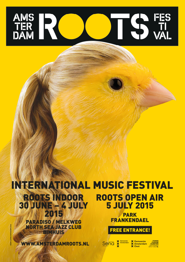
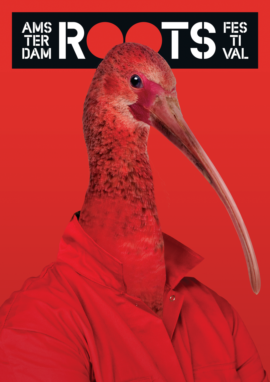
Every year we create a campaign image to announce the festival. Amsterdam Roots takes a week filled with concerts, film screenings and other activities at indoor locations, and ends up with an open air day at a city park, with an extensive schedule of music acts, circus performances, workshops and food.
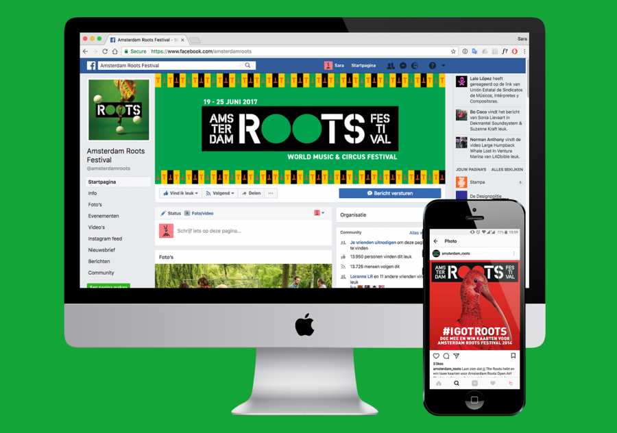
For three editions we worked with images of colorful birds as a metaphor to tell about the exotic visitors and sounds coming to Amsterdam. We created strange ‘humanized birds’ and ‘birdified humans’.
Since 2017, the festival has included circus as a strong part of its program. Therefore the campaign has twisted into that direction, keeping its aesthetic essence of mystery and fun.
Photography in collaboration with Benning&Gladkova

Off- and online communication
Of course, all principles of the identity and campaigns apply to different formats and media, from brochures to ads and the website itself.